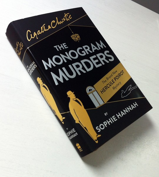
They say that print is dead. Well if that’s the case then death is beautiful. Minutes ago there was a thud on the welcome mat here at Crime Fiction Lover HQ and what a thud it was. Inside the envelope we found this gorgeous printing of The Monogram Murders. Due out on 9 September, the book sees contemporary psychological thriller author Sophie Hannah reviving Agatha Christie’s world famous Belgian sleuth Hercule Poirot.
We’ve got a review in the pipes, be assured, so what I really want to show you today is how wonderfully this hardback book has been produced. The design was all done by HarperCollins’ internal design team and it’s magnificent.
Above, you can see that the jacket features embossed sliver lettering for the title along with gold for certain design elements including Poirot himself.
Remove the dust jacket, and it’s not just a matt black finish. This book looks like a gold bar.
The end papers also feature the gold ink, along with the lift/elevator motif from the front cover and what appear to be clues from the storyline.
Inside, the text is generously sized and spaced with the book stretching to 373 pages. The paper, ink and binding smell delicious.
Here’s another nice touch, the inside of the dust jacket is printed on as well, with a silhouette of Poirot at the centre of a basic symmetrical design. Note that emboss on the title text coming through.
You might not be able to see it in the main image, so maybe this one makes clearer the use of gloss and matt finishes on the front cover giving the book an extra tactile quality unmatchable on a Kindle.
Here’s a detail from the cover – a chalk outline of the victim. Do they even do that anymore?
Finally, here’s a square-on shot of that cover again. 9 September, folks.
Watch for our review, along with a Poirot primer that will be appearing as part of Classics in September 2014, sponsored by Bloomsbury Reader.